
Leaders are continually told to transform their organizations into a data-driven business. Construction firms are not exempt from this concept. There are countless figures a firm can use to create awareness and further its strategic goals.
However, business leaders are constantly trying to extract data from disparate systems. In the end, many construction firms end up looking at only a small handful of figures—net profit, gross profit, cash and modification rate, to name a few. These firms then work feverishly to make connections to correlate their performance with the right information.
Key performance indicators (KPIs) will vary for every firm. Additionally, the gradations within the key performance indicators will vary. For instance, a financial metric will be extremely customized for any firm.
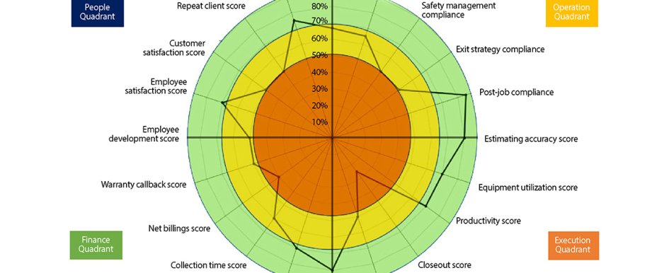
The most important consideration should be measuring the items that directly correlate to the vision and core values of the firm. A vehicle, such as the “Strategy Spider” shown in Figure 1, allows for visualization and compartmentalized metrics for every aspect of the business.
Compartmentalization
A firm’s KPIs are specific to that individual firm. At a minimum, you would expect some main headings to include:
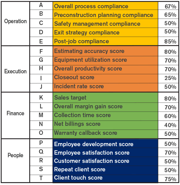
- Operations quadrant—The processes that will drive superior performance
- Execution quadrant—The downstream measure of a firm’s ability to perform
- Finance quadrant—The financial metric that combines several aspects other than profitability
- People quadrant—Internal and external satisfaction and engagement
The key is to identify metrics that holistically describe the firm. For instance, when a firm only looks at profitability, it loses perspective on other aspects of its health. Just like a patient seeing a doctor, one’s weight might be in line, but health metrics, such as cholesterol, sugar, triglycerides, blood pressure and pulse, might tell another story.
Normalization
One aspect of analyzing data comes in the form of comparing apples and oranges. For instance, “employee satisfaction” is a subjective score, while “collection rate” is a defined, financial formula that is universally recognized.
One aspect of the Strategy Spider is that it creates some level of normalization. Process compliance—or a firm’s ability to follow its processes religiously—is somewhat simple to measure. For instance, if a firm started five projects this month, they should have had five preconstruction planning meetings.
On the other hand, it is more complicated to connect a score relative to training and development. The scores shown are defined by the firm. In this case, if the firm states it ideally expects its associates’ time spent in training and development to be at least 10 percent of their billable time, the correlated score is 100 percent. The key here is that the firm defines what is the correct score. Another great example is collections.
A firm that does work for a government or municipal client might expect a lower collection time, whereas a private client might have a higher collection time. Thus, the firm defines the scoring web criteria that is applicable to its client base, assuming these are also stretch goals that drive higher performance.
Visualization
The scoreboard in the penultimate piece of this entire equation. Senior management and ownership have the ability to look at financial statements and gauge performance, but what about the rest of the firm’s team?
There is always some trepidation of over-sharing classified information, but by normalizing the scores, there should be less fear of information “falling in the hands of the enemy.” A score of 80 percent, or a score that lands in the yellow area of the web, is less damning than an overall profit number of $6,540,800.
While the web is one visualization, a heat map has a similar effect.
This map technique simply allows the reader to hone in on specific “hot areas.” Similarly, the webbing on the Strategy Spider gives the same depiction. If the firm hovers in the green ring, they are performing at a high level. However, as is often the case, the firm can target specific problem areas.
For instance, using the Strategy Spider shown, the firm is not performing well in the following areas:
- Firm exit strategy—This is a measure of the firm’s compliance to conducting routine closeout meetings to ensure successful project completion
- Warranty callbacks—The firm has a high level of callbacks for warranty issues or defects
- Customer satisfaction—Customer feedback is negative and not within the targeted tolerances
Most importantly, a firm can look at the big picture in one visualization to determine correlation. A firm should not be shocked to learn that their incident rate is higher when they are not following the safety protocol. The aim of the Strategy Spider is not to recreate the wheel or replace financial statements.
Firms need to share this data internally so the entire team can see how these elements correspond to one another and the overarching strategy.